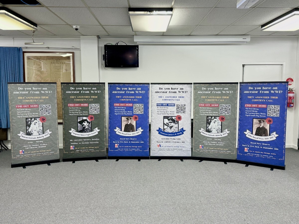
For my HSTY3811 project this semester, I worked with the City of Canada Bay Museum, making a series of posters and a pamphlet for their “They Answered Their Country’s Call” collection. This consists of over 1600 biographies of local WWI veterans, and the museum wanted a way to share the collection with the public in an accessible and interesting format. The 1.4mx0.8m posters are of four people, one for each poster. It features a picture of the person, linking the local history to a visual that people can relate to. The poster also has information on how to learn more about the collection. I received full creative control over these posters, something I’m incredibly grateful for. However, I did my very best at each stage to ask and implement feedback from the volunteer staff, as this is as much their project as it is mine.
This is something that supports the local community. The museum, their main reasoning behind the collection was to have an ongoing archive of local WWI veterans. This means that not only do the posters relate to local people’s own relatives, but if someone wanted to add their own relative to the collection, they could do so. Each poster has a QR code that links to a website about the collection. Whilst the website needs to be refined and a few more conversations need to be had between relevant organisations, it will hopefully result in a website with some further access to the collection and a way to contact the museum to contribute a person’s own relatives. The posters will be placed in 4 locations, rotating between to switch up the person featured. They were created in a standard format as well, meaning if more posters were to be made, they would be added to the existing group of posters. Whilst this has not happened yet, since the posters and pamphlets have not been made, this is the hope for the project.
The general theme of the posters is a vintage but colourful style. There is a paper-like texture to the posters, adding a more ‘authentic’ feel. Each person has a different background, representing where they served, e.g. Army = green background. This is a nice tie into the people’s positions and the ways they served in WWI. The other colours were chosen because they stand out from their respective backgrounds. Yellow and red were used in three of the posters, representing the poppies and the gold medals some received for their service. Blue was used in the fourth poster to represent the Australian flag and the seas travelled by these people. Each poster includes where the person served and also how they are linked to their local community. The names of each person are on a ribbon banner, similar to banners used in local honour boards. The fonts chosen can be seen as a modern twist on older poster fonts.
The pamphlet has a summary of the lives of each of the four people, giving more in-depth information about their personal lives and service to their country. It also lets people know that they can add to the collection if they wish. The pamphlet also includes the QR code and 4 locations featured on the posters. Additionally, it has a set of contact information specific to the City of Canada Bay Museum and Heritage Society, some of the people who are now in charge of the project. These pamphlets will be kept near the posters if people want more information but also can be brought to other locations where the posters aren’t being featured. This gives the project a larger reach since the City of Canada Bay is a large area.
Finally, as a volunteer at the Museum, I also helped contribute to their monthly newsletter, Nurungi. This is released both online and in hard copies and is distributed to members signed up with their email addresses. I helped to edit and find sources for one September article written by the previous secretary, who had been working in the City of Canada Bay Heritage Society for over 50 years. The article was on the history of fireplace tools, such as tongs and pokers. This is because the museum does have a set of tools that joined the collection. Each month, articles are based on either new items or displays that the museum has made, or relevant events and anniversaries – for example, for October, the museum had an article on Halloween’s history and presence in the local community.
Throughout this process, I had weekly in-person meetings with the museum staff and assisted in other ways. This was to build a connection with the local community since most staff members come from the area. Whilst these people are all volunteers, they were incredibly dedicated to their work and ensuring that this project progressed regularly. These meetings were also to get details on what needed to be on the posters and pamphlet and to get feedback on the progress, aesthetics and elements of the posters and pamphlet. The feedback, advice and relevant details were incredibly beneficial to create a final design that was suitable for the wider community, especially older members of the community. Since I happen to be a younger person, my design and technology skills were more appropriate compared to the museum staff. However, their expertise on what stood out to them in my designs was greatly appreciated, as it sometimes ended up quite different to what I thought was visually better.
Overall, I’m very proud of what I’ve managed to create for this semester-long project. The final designs have been through many changes and we have collectively come to the best design and format. In future, a project like this would benefit from seeing how effective this collection turns out to be, possibly through questionnaires or surveys about the collection. I will be in communication with the museum beyond this semester, not only to assist with making these posters and pamphlets a reality but also because I enjoyed volunteering with them.

